

We developers and designers are regularly tasked with creating efficient and pretty navigation. This has never been easy and has resulted in many approaches to make the grouping of hyperlinks to be attractive and useful. Mobile devices changed the way users can interact with websites and added complexity to an already convoluted task. The lack of hover behaviors and the small screen sizes make for an interesting challenge to users and developers alike.
In my quest to make a responsive design, I came across several approaches to mobile navigation. I’ve discussed 4 approaches below. There are many others out there for designers to consider. The primary thing you should take away from this post is that there is no one-size-fits-all solution. You should decide which solution fits best with your project.
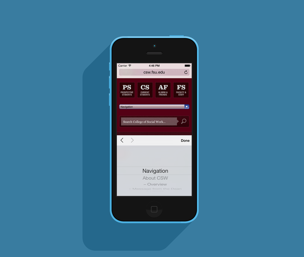
Select dropdown
One of the simplest forms of mobile navigation I have found is the drop down (aka select element). You are probably used to filling these out on forms and they are a testament to the ingenuity of the web design community. This is another example of designers and developers using a tool not quite as it was intended (::cough:: tables ::cough::).
Though they are a creative workaround here’s my thoughts:
Pros
- Very simple to implement.
- They are almost guaranteed to work on all platforms.
- If code duplication is necessary, it is at least minimal code.
- Requires simple Javascript to make them behave like links.
- Does not use large amounts of vertical space.
Cons
- People usually associate these as forms, not navigation.
- Styling them consistently between platforms is nearly impossible.
- Each browser deals with them slightly different.
- Hierarchy is difficult to display attractively. Most designers use hyphens which is not attractive.
The Cram N’ Cry
I have lovingly labeled this next one “The Cram N’ Cry.” This is because it should be used very carefully and I have seen it abused on multiple occasions. The navigation should automatically adjust to the screen size and create new rows if necessary. When used properly it can be a very attractive navigation solution. It is ideally used on sites that have a simple navigation with no more than 1 level. Regrettably this nav is often used to display too many links with excessively long titles.
Pros
- Simple to implement but requires a good understanding of CSS.
- If built correctly, it should behave similarly on most systems.
- Doesn’t require any JavaScript or duplicate code.
Cons
- Is only effective when using a small number of navigation items.
- Can take an excessive amount of vertical space. Vertical space is precious on a 3.5” screen.
- Could cause frustration for fat-fingered users. The links need to be big enough and separated well enough for the chubbiest of fingers to select the correct link.
- Isn’t conducive for showing hierarchy.
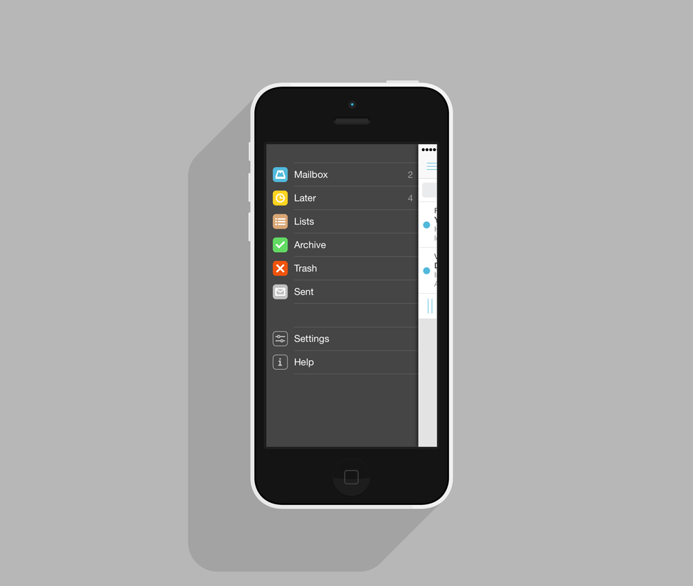
The Toggle
This is one of the most often seen mobile navigation patterns. It is a very flexible way to display the navigation in a pseudo-visor method. This allows the mobile navigation to operate independently of the desktop navigation and can be customized to suit the site’s needs.

Pros
- Very flexible in implementation and can be visually attractive.
- Doesn’t take up considerable space when not open.
- Most of the JavaScript used is very simple and has been thoroughly tested.
- If built correctly, can show hierarchy well.
- Many open source examples and tutorials already exist.
Cons
- Can be difficult to build. Usually requires some custom JavaScript.
- Compatibility between platforms could be an issue.
- If using considerable amount of transitions or effects, the load time and behavior could be problematic.
Off-Canvas
The off-canvas approach is a new-comer to the area of navigation patterns. It has been popularized by several native mobile applications and a few large web applications such as Facebook. This navigation method allows the developer to use the full vertical height of the device while not obscuring content. I expect we will start to see this method used more frequently as it is standardized and tested.
Pros
- Attractive design that shows effort and thought into the user experience.
- Plenty of room for a long list of links. Though not preferred, the nav can be made to scroll.
- Can show hierarchy very well via indents or colors.
- Is natural for those accustomed to native mobile apps.
- Can be integrated with Swipe gestures.
Cons
- Can be difficult to implement. Requires substantial experience with HTML/CSS and JavaScript.
- Device and browser compatibility can be an issue.
- It may cause confusion to new users. For example some people are not accustomed to the hamburger icon that is often used with this solution.
Wrap-Up
These are just a sample of the various types of mobile navigation patterns. I encourage you to test each of them out and see what fits your project. If you can think of any others I should mention, I’d love to hear your thoughts on twitter @alexjlehner.
Some cool resources to keep you going:
- Toggle Navigation Tutorial
- Pull-Down Navigation (Super neat)
- Complex Mobile Navigation Patterns
- Responsive Retina Menu
iPhone mockups credit: Pixeden.com.